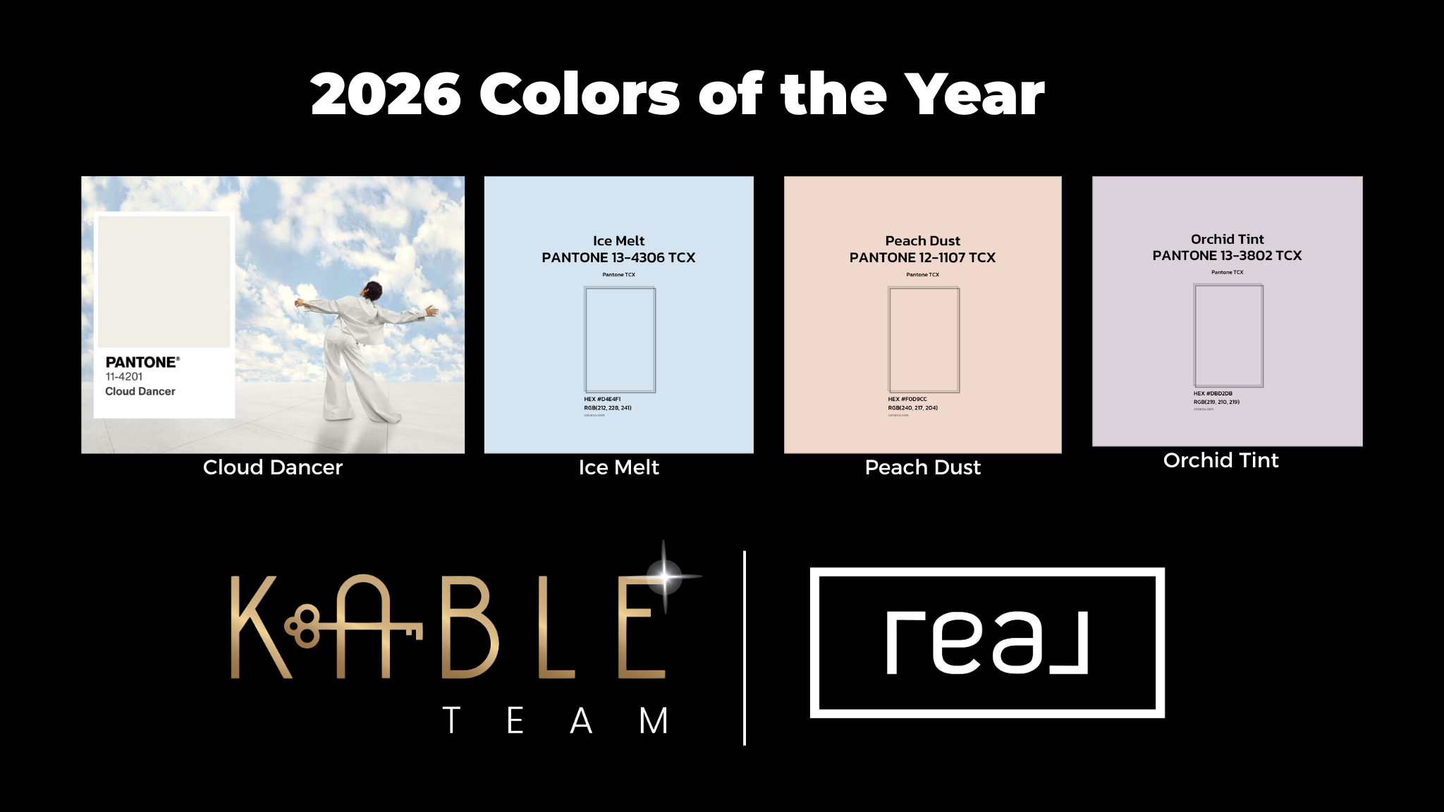
2026 Paint Colors of the Year
This year’s Pantone Color of the Year reflects a shift toward light, calm, and versatile design that brings clarity, serenity, and timeless elegance to any space. Pantone selected Cloud Dancer (PANTONE 11-4201) — a soft, natural off-white that feels like a breath of fresh air amid busy modern living.
By Tracy Kable
In 2026, the trending palette embraces quiet sophistication and effortless adaptability. These shades work beautifully in virtually every room, making spaces feel brighter, more open, and inviting. Whether you’re staging a home to sell or updating interiors for everyday living, these tones provide a fresh canvas that harmonizes with your décor and lifestyle.
Cloud Dancer by Pantone
Cloud Dancer is a soft, airy off-white with just the right balance of warmth and coolness, giving it an effortless neutral quality that never feels cold or stark. It’s been chosen to represent calm and clarity in design, acting like a blank canvas that enhances natural light and creates a sense of spaciousness in any home.
This shade works wonderfully on walls, ceilings, trim, and cabinetry — elevating spaces without overpowering them. It’s perfect for living rooms, kitchens, bathrooms, and hallways where you want a clean, cohesive feel that looks larger and brighter.
Ice Melt by Pantone
Ice Melt is a crisp, airy blue with cool undertones that brings brightness and clarity to any space. It’s ideal for walls, ceilings, and trim, helping rooms feel larger and more open while providing a fresh, modern foundation. This shade works especially well in homes with limited natural light, creating a clean backdrop that allows architectural details and furnishings to stand out.
Peach Dust by Pantone
Peach Dust is a soft, muted blush that adds warmth without overwhelming a room. Subtle and inviting, it’s a beautiful choice for bedrooms, sitting rooms, or accent walls where a touch of color can create comfort and charm. This gentle hue pairs well with light woods, creams, and soft metallics for a timeless, welcoming feel.
Almost Aqua by Pantone
Almost Aqua offers a calm, refreshing blend of blue and green that evokes a sense of ease and balance. Perfect for bathrooms, kitchens, or relaxed living spaces, this color brings a light, coastal-inspired feel without feeling overly bold. It works well alongside white cabinetry, natural stone, and warm neutrals for a clean, serene look.
Orchid Tint by Pantone
Orchid Tint is a delicate lavender with a soft, powdery finish that adds elegance and personality to a space. Ideal for bedrooms, offices, or creative spaces, this color introduces subtle sophistication while maintaining a peaceful atmosphere. It pairs beautifully with warm whites, soft greys, and natural textures for a refined, modern look.
Enhance Your Home with These Trending Colors
Whether you’re selling your home or simply updating your interiors, 2026’s soft neutrals and subtle accents offer a fresh, breathable palette that adapts to every style. From airy whites that make rooms feel open and peaceful to deeper hues that define space and character, these colors create an atmosphere that feels balanced, warm, and timeless.
Get a Complimentary 1-Hour In-Home Consultation
Need expert advice on how to incorporate these trending colors into your home? Our team is here to help! For a free consultation, reach out to us today at tracy@thekableteam.com or call/text 304-283-8680.